
What is a Cloud Widget?
A Cloud Widget is a configurable component of the Cloud used to display Athlete Data in a variety of formats, such as tables, graphs, and charts. Widgets allow you to visualize, filter, and compare data in dashboards and PDF reports.
Creating a Cloud Widget
There are two ways to create a new widget:
- In OpenField Cloud, go to Timeline, click on an empty Widget Tile on your dashboard.
- A dropdown menu appears with the following options:
- Add New Widget
-
Wizard
Option 1: Wizard (Recommended)
Select Wizard to launch the Widget Wizard, which:
- Guides you step-by-step through widget creation
- Displays a live preview as you configure the widget
Option 2: Add New Widget
Select Add New Widget to create a blank widget. This option is best for experienced users who want full control from the start.
After creation, customize the widget using the settings panel. See Customizing a Cloud Widget
Viewing Specific Athletes in a Widget or PDF Report
To display data for specific athletes:
- Navigate to the PIP or Team section.
- Click individual Athlete Boxes.
- If selecting from a Team Box, first choose a team from the dropdown menu.
- Selected athletes appear in the Selected panel.
Athlete Colours
- Athlete box colours correspond to their team.
- Team colours are configured in: Settings → Teams → Edit → Primary Colour / Secondary Colour
Customizing a Cloud Widget
Access widget settings by selecting the Settings (⚙️) icon in the top-right corner of the widget.
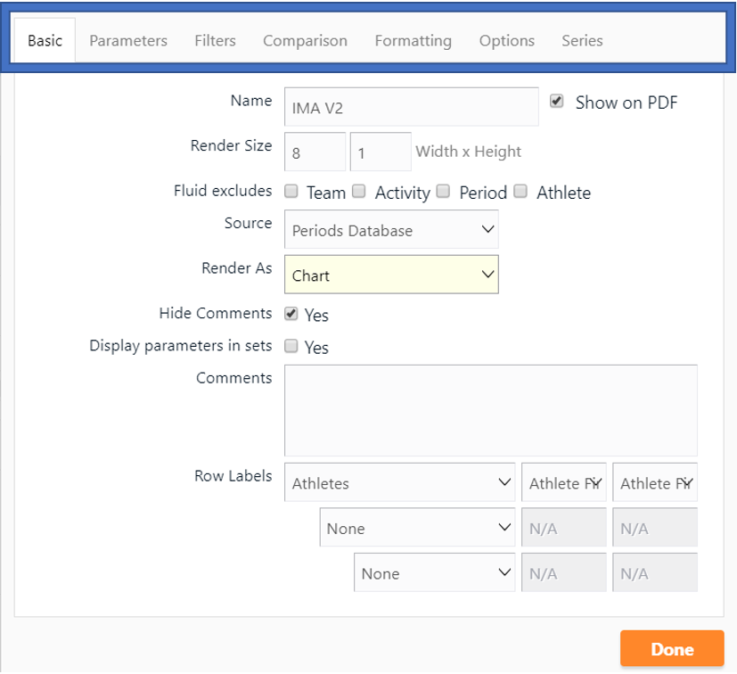
Basic Tab
Allows you to configure general widget settings:
a. Title – Edit the widget title
b. Widget Tile Size – Adjust widget size on the dashboard
Note: Units correspond to inches in PDF exports
c. Exclude Fields – Remove selected fields from display
d. Widget Type – Choose the widget format (table, chart, etc.)
e .Show Comments – Toggle comment visibility
f. Comments – Add comments to the widget
g. Primary Row Label – First-level grouping (e.g. Activity)
h. Secondary Row Label – Second-level grouping (e.g. Period)
i. Tertiary Row Label – Third-level grouping (e.g. Athlete)
j. Row Sorting – Alphabetical, chronological, ascending, or descending
The Result:
Parameters Tab
Allows you to select which parameters are displayed in the widget:
- Search for parameters manually or using the Search Bar
- Add parameters by:
- Double-clicking, or
- Dragging them into the Selected panel
The Selected panel defines which parameters appear in the widget.
The Result:
Filters Tab
Allows you to filter data shown in the widget:
- Select a filter category (e.g. Tags, Athletes, Teams, Positions)
- Choose a condition:
- = Include only selected items
- <> Exclude selected items
- Specify the filter values
- Click Add Filter to apply
To modify an existing filter, select Update.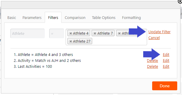
Comparison Tab
Allows you to compare activity data against Average Sets:
a. Colour Rules – Change data colour based on comparison results
b. Average Set Selection – Choose which average set to compare against
c. Comparison Method – Define how values are evaluated
The Result:
Formatting Tab
Allows you to apply visual formatting to data:
a. Select parameters, sessions, periods, or athletes to format
b. Define the range (percentage or absolute values)
c. Choose formatting style:
- Cell colour
- Row colour
- Text colour
- Symbols
d. Manage formatting priority or remove rules
Table Options Tab (Table Widgets Only)
Allows you to set advanced table settings:
a. Text Colour – Set font colour for data and row labels
b. Display Comparison – Show comparison data in adjacent columns or within the same cell
c. Limit Rows To – Restrict number of visible rows (0 = no limit)
d. Limit Rows to PDF – Automatically resize widget to show all rows in PDF export
e. Horizontal Scroll – Enable horizontal scrolling
f. Abbreviate Headers – Shorten parameter headings
g. Parameters as Rows – Display parameters as rows and athletes as columns
h. Display Summary – Add summary data to the table
i. Alignment – Set text alignment
j. Decimals – Control decimal precision
Chart Options Tab (Chart Widgets Only)
Allows you to configure chart-specific behaviour:
a. Enable radial charts
b. Swap X and Y axes
c. Swap parameters and categories
d. Show or hide Y-axis
e. Show or hide Data Labels
f. Show or hide Legends
g. Stack bars
h. Display stacked values as totals or percentages
i. Configure Y-axis visibility
j. Format Y-axis label name
k. Format side Y-axis is displayed on (left/right)
l. Set minimum, maximum and interval values
Series Tab (Chart Widgets Only)
Allows you to customize individual data series:
a. Type – Area, area-spline, column, line, pie, scatter, or spline
b. Y-Axis – Assign series to left or right axis
c. Order (Ord) – Control display order (relevant when series overlap)
d. Decimals (Dec) – Set decimal precision
e. Series Options – Toggle:
- Data labels
- Z-score
- Trendline
Related articles